Designing Louder Than Words: Aberlour Bottle Box competition
Aberlour Bottle Box Design Competition
Scotch bottle boxes serve more than one function: they protect the bottle while in transit, provide a place for information about the liquid inside, and formalize and premiumize the whisky drinking experience – making a bottle of Scotch just a bit more special. Bottle boxes embody the spirit they guard and are an opportunity to tell a story about a brand, about a place, or about flavor. Boxes for special release whiskies are designed by acclaimed architects, made by skilled carpenters, and adorned by celebrated designers – and coveted by whisky collectors worldwide.
Aberlour, a prominent Scotch whisky distillery, offered a prize ($4,000 for the winner, $1,000 for the runner up) for designers, architects, and creators for their take on a bottle box for Aberlour Single Cask No. 22112, a limited-edition bourbon cask aged single malt whisky inspired by Chicago. While traditional packaging designs emphasize the brand identity, this competition asked designers to draw inspiration from their surroundings and from the liquid itself. The Design Museum worked with Aberlour and Cork + Knife Communications to market the entries, manage submissions, and participate in the selection of the winner.
The call to action was quite simple: design a box that safely holds a bottle of Scotch whisky that is inspired by Illinois’ great city of Chicago. Designers were encouraged to use any material that they felt embodied the city of Chicago: paper, wood, glass, metal, keeping in mind that the winning design needed to be premium and at the same time economically reproduced 275 times.
Finalists
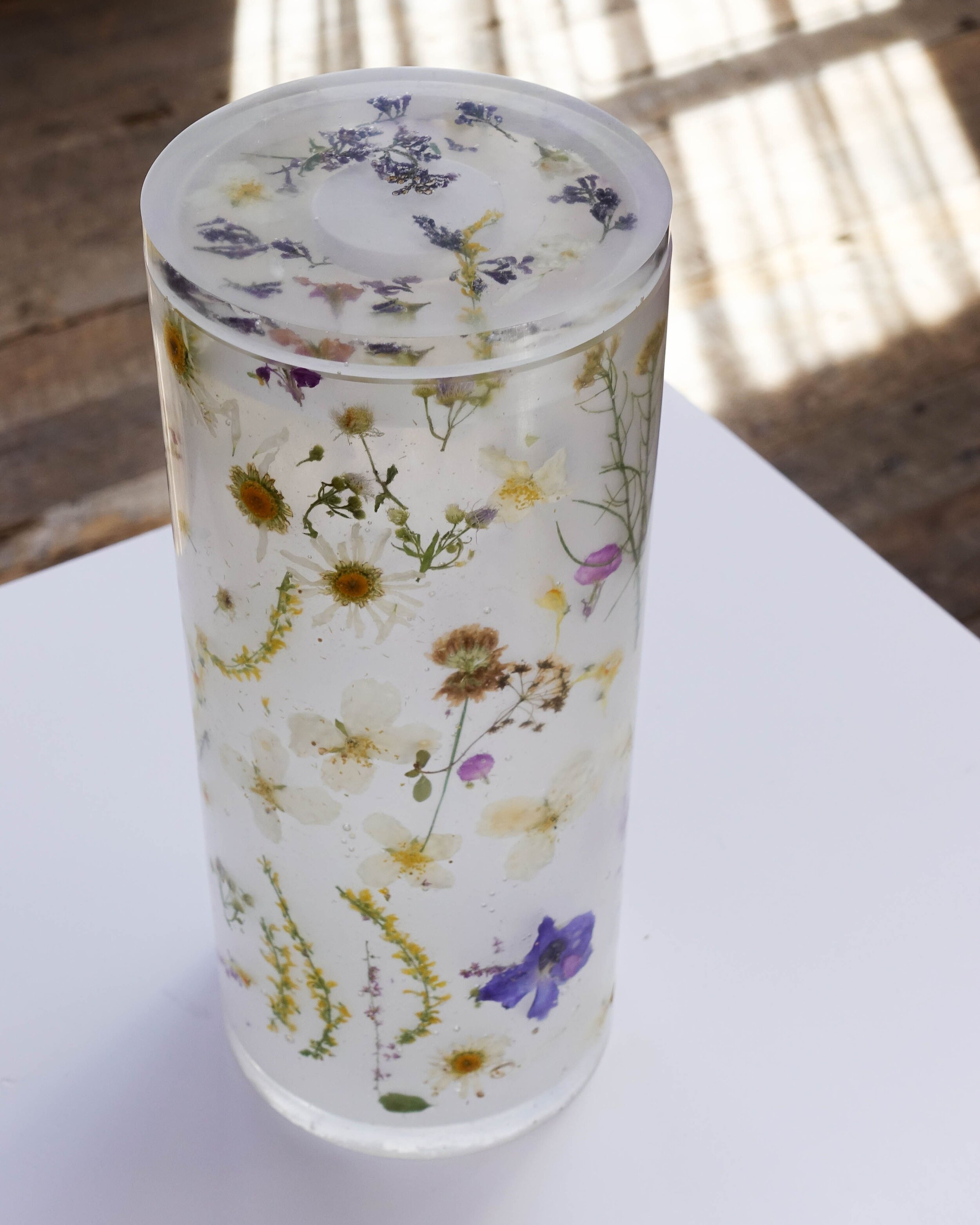
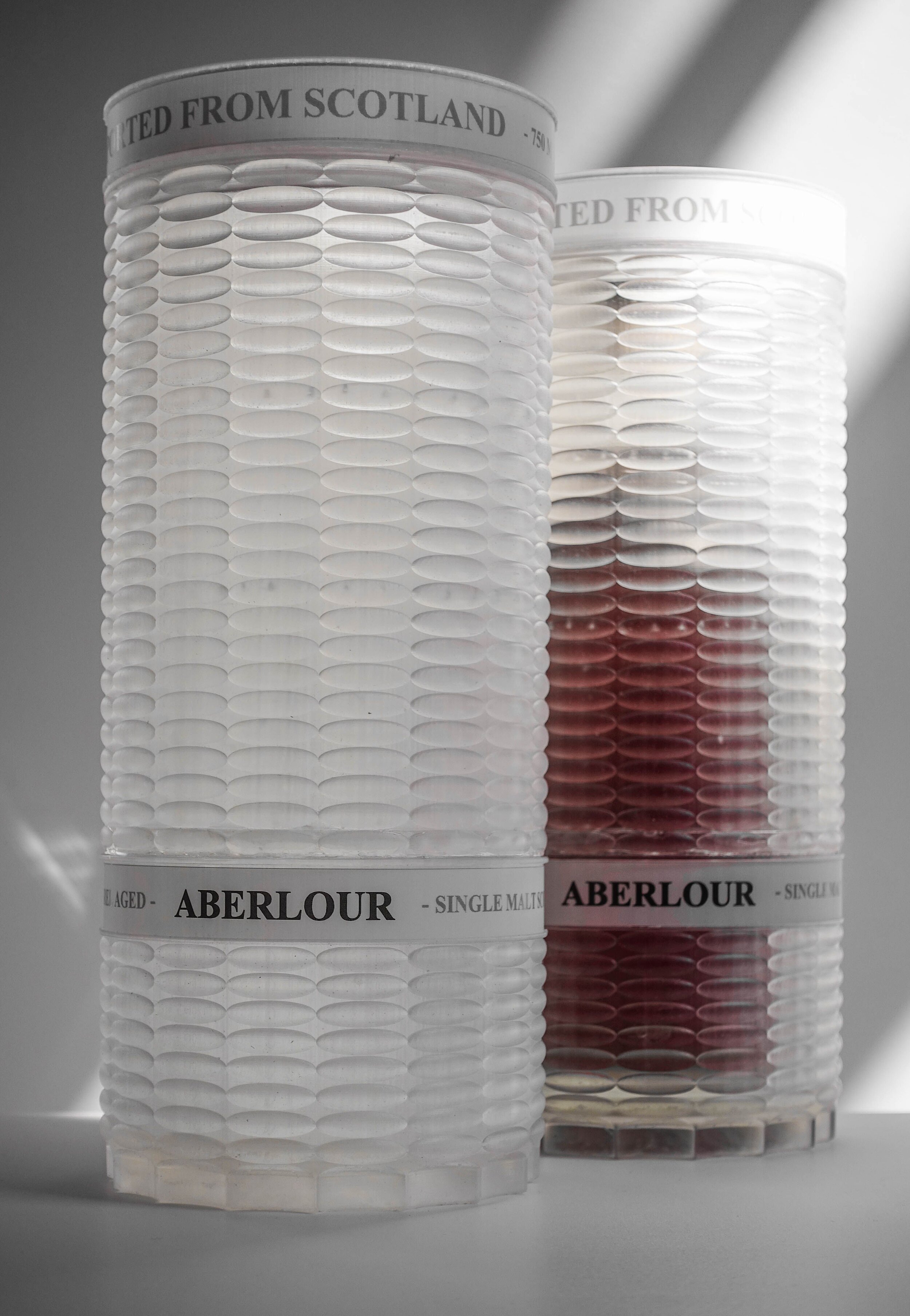
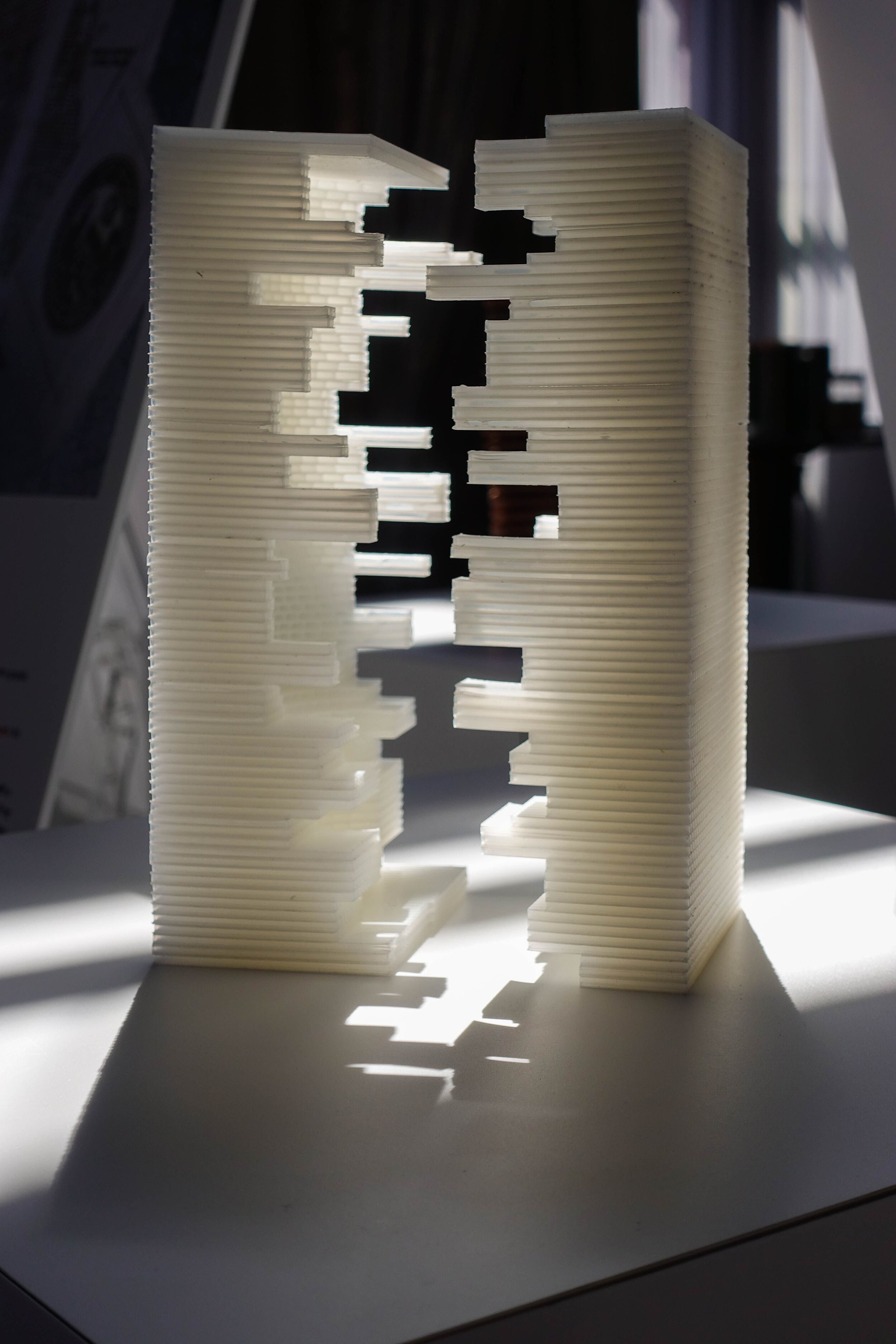
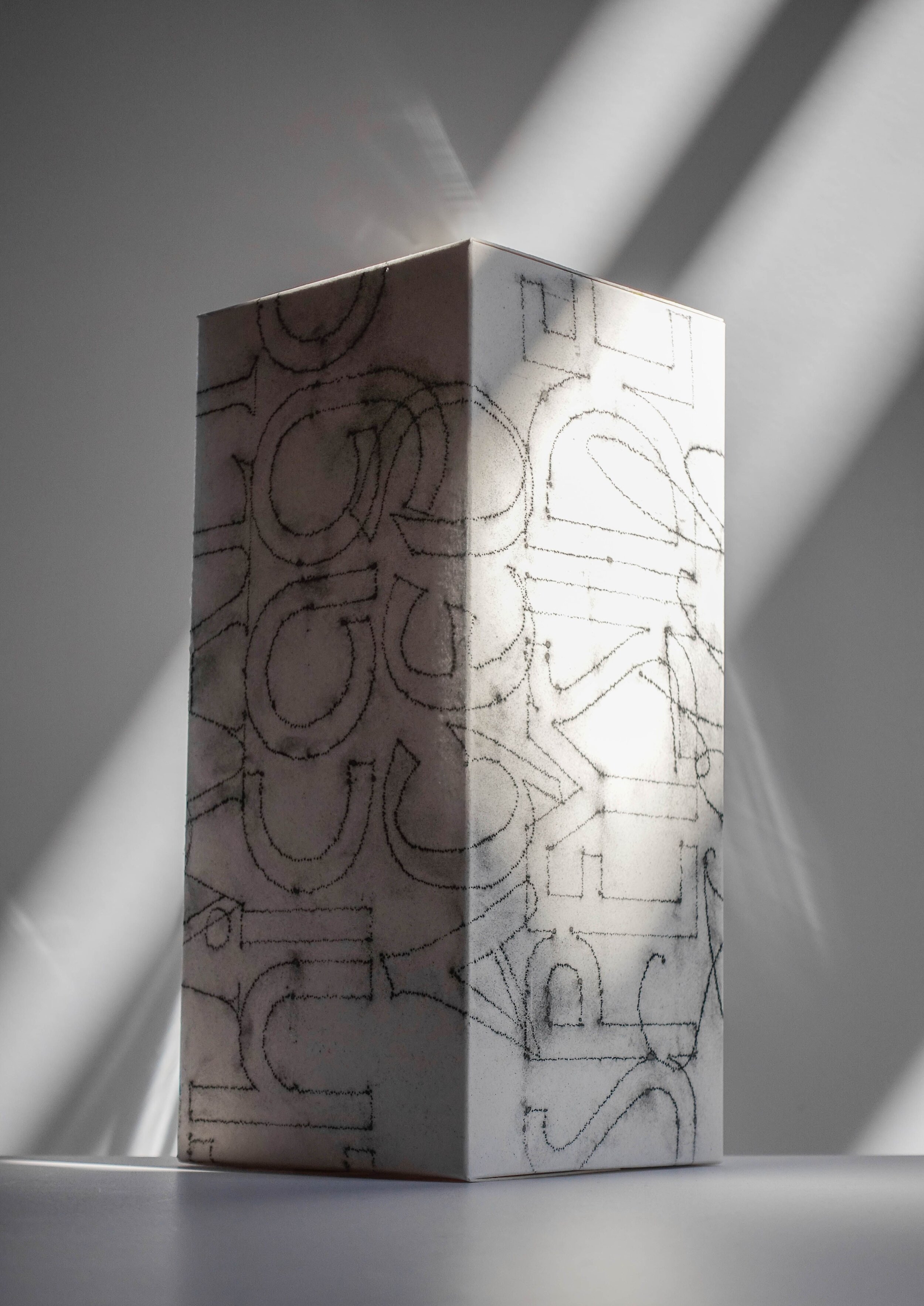
A jury of designers, entrepreneurs, architects, marketing professionals, and representatives from Aberlour went through an extensive jury process, hosted by American Institute of Architects Chicago. Finalists included came from designers and architects around the world, including the outstanding designs of Nicholas Berchtold, Brad Lynch & David Mulder, Robert H. Canizaro, Andrew Mack & Michal Ojrzanowski, Aaron Tsang & Wesley Ho, Babs Owca, John Terdich, Antonio Filippo Tandoi & Ivan Zito, and Gregory Zychowicz.
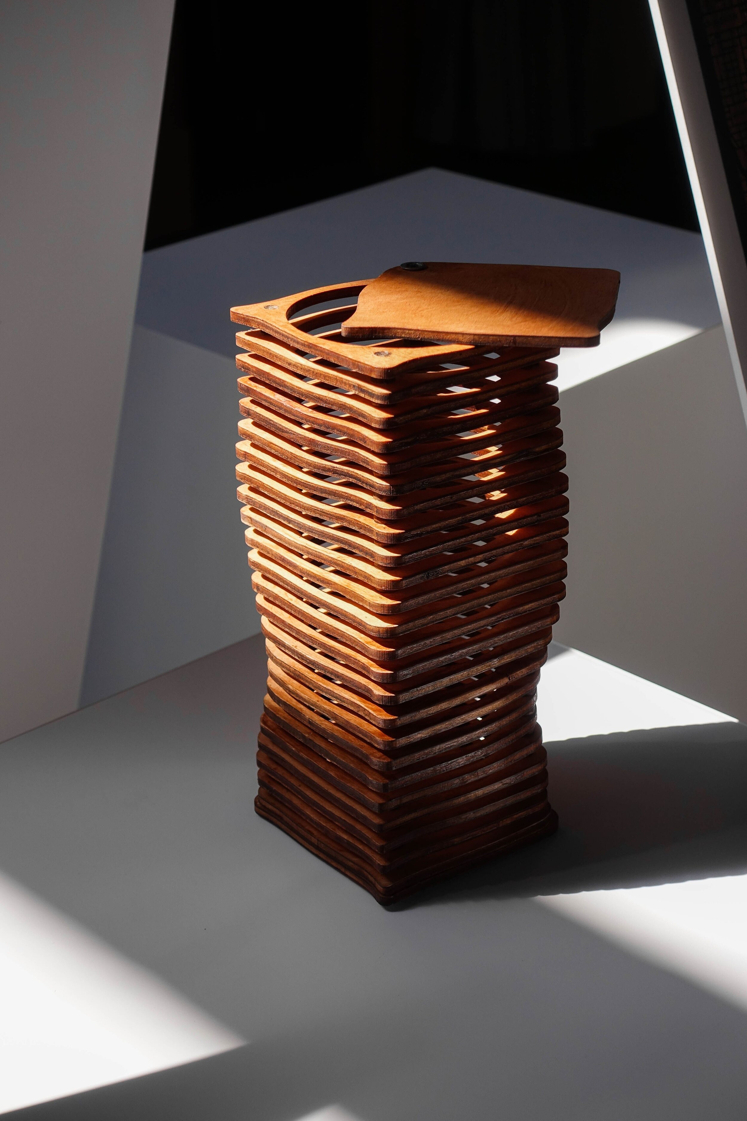
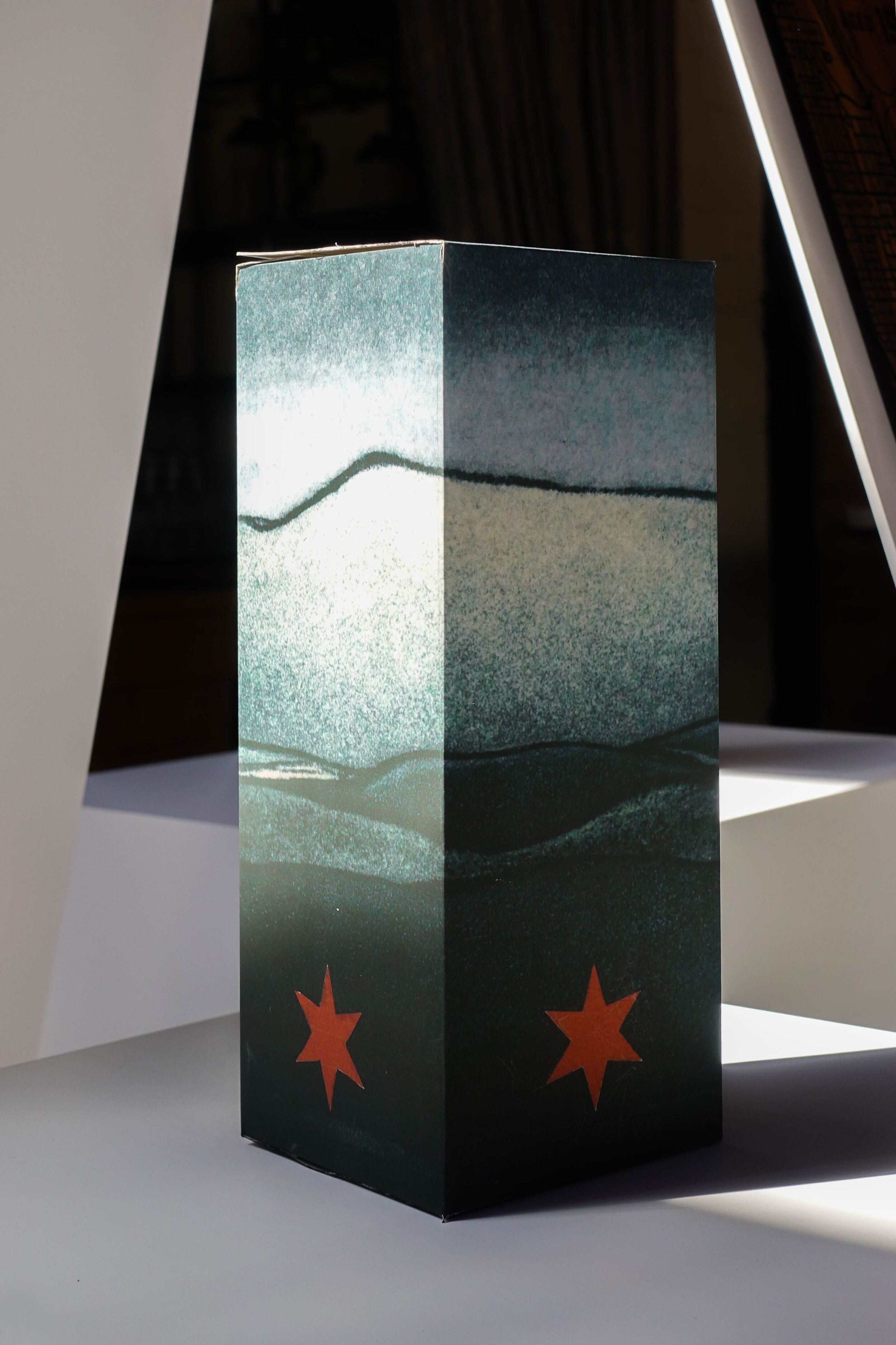
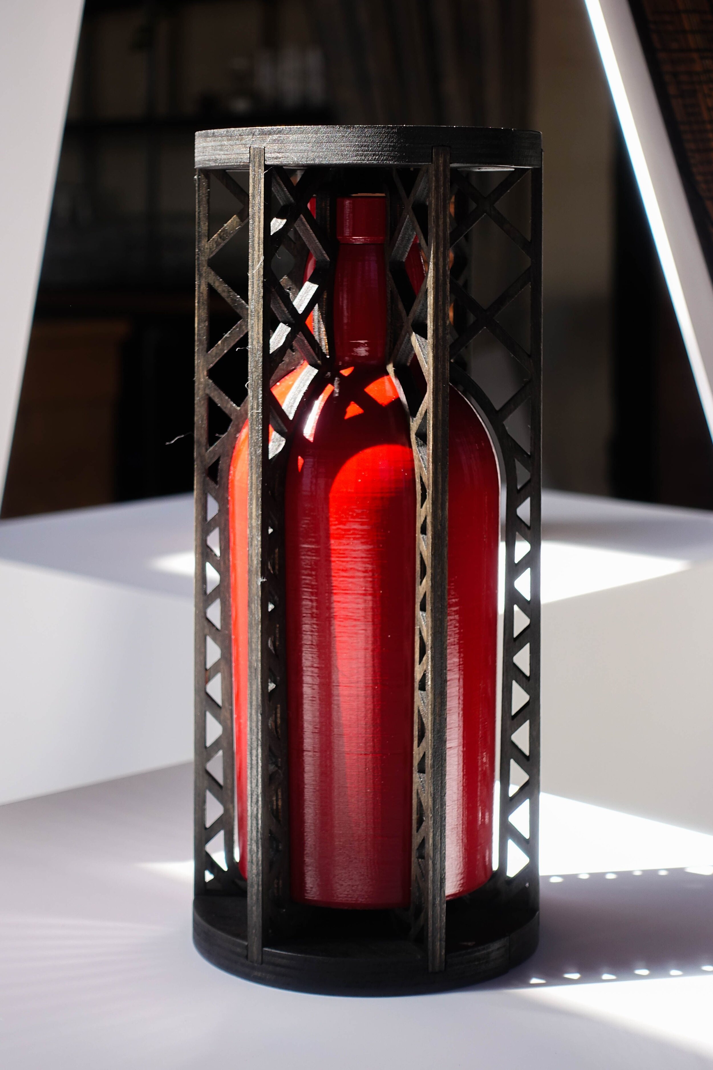
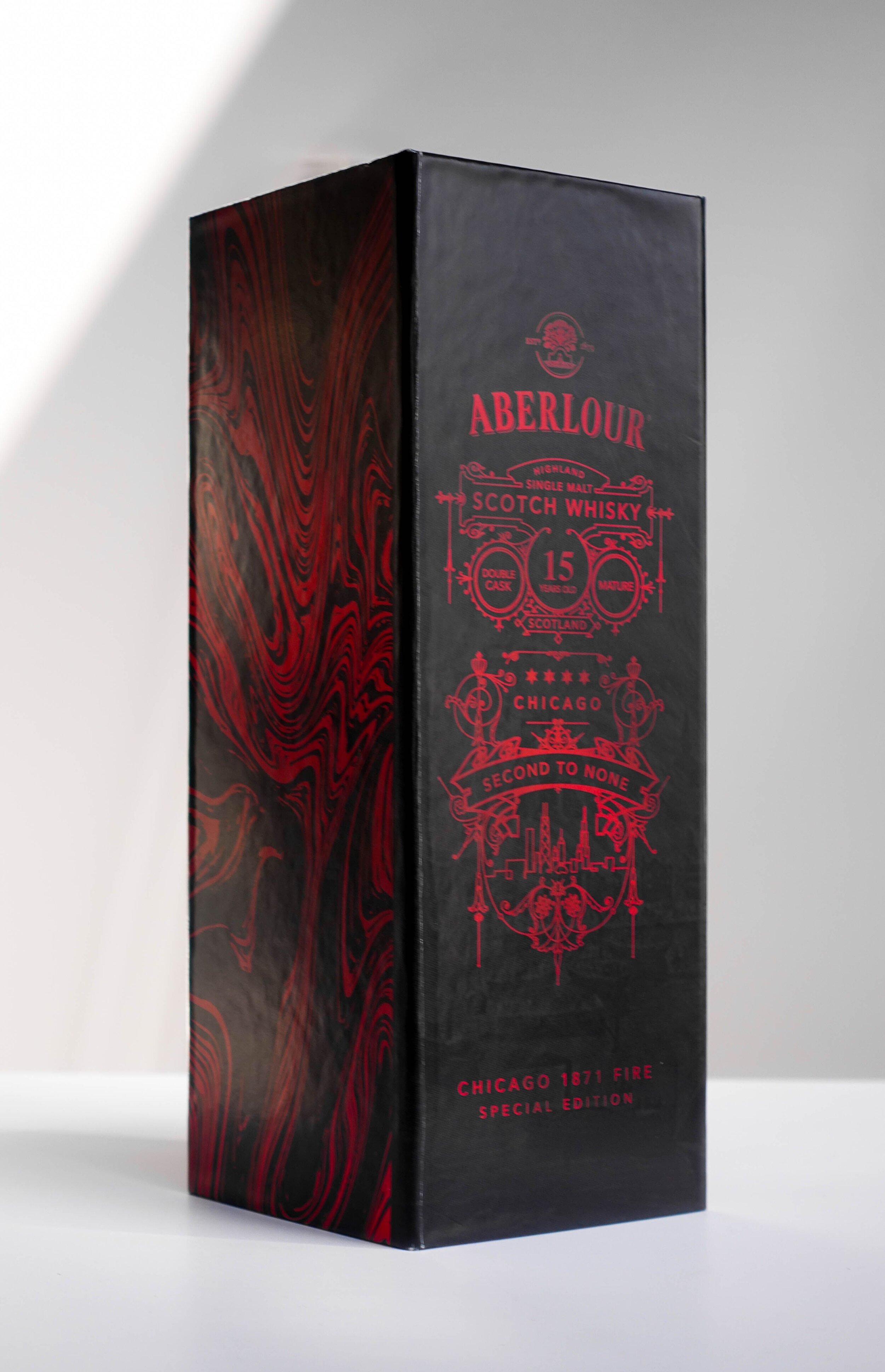
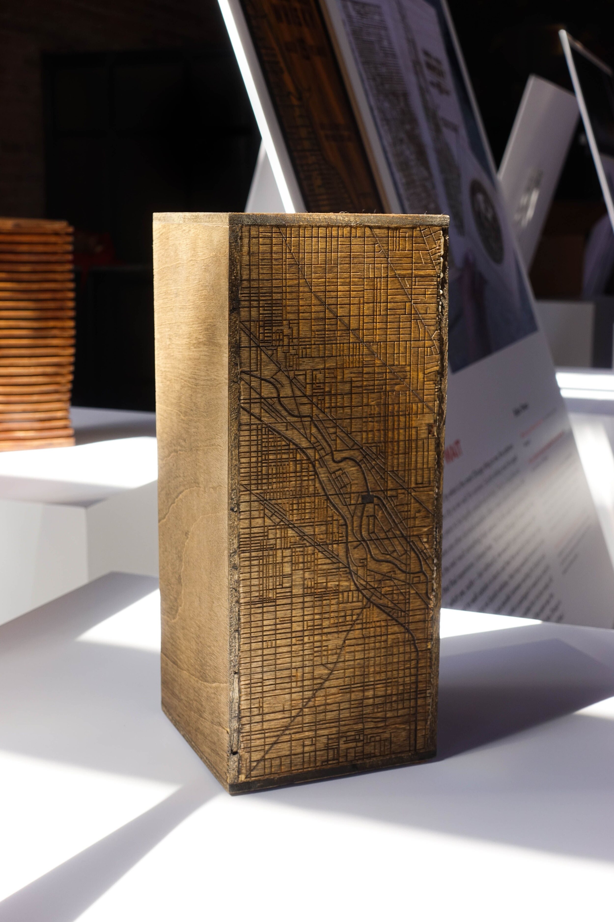
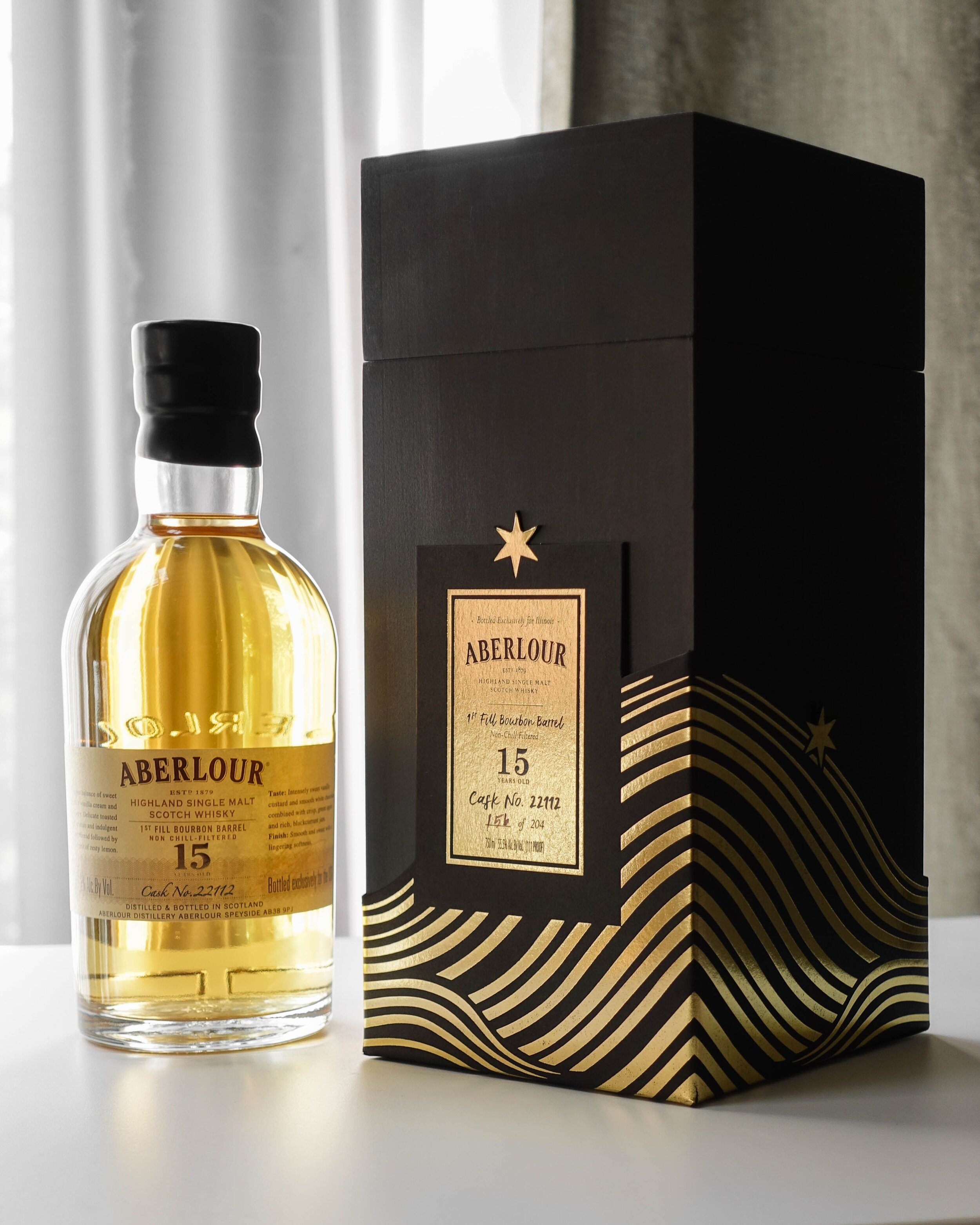
The competition winner was Taylor Mentzer with Scorch.Box.
Mentzer’s design utilizes a charred wooden box, drawing inspiration from the Chicago Fire, wave patterns that evoke Lake Michigan, and brass-colored accents as a tribute to the history of Chicago jazz. The box was produced locally, with Rohner Press creating the wrap and WDI Companies in Forest Lake, MN producing the box itself.
The Winner
Our Role
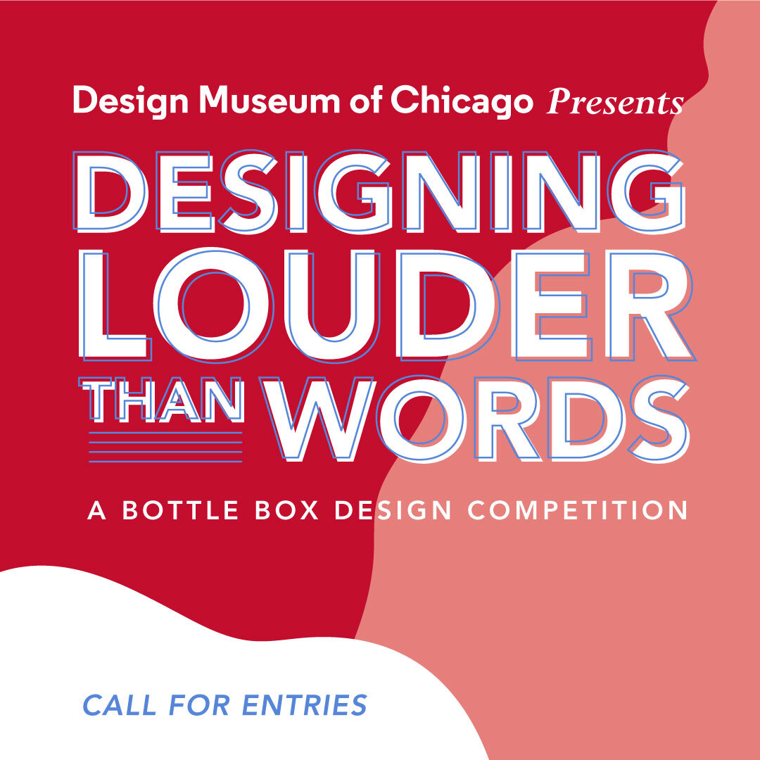
The museum designed the competition’s brand and marketing assets. It was important to Cork + Knife that the brand colors paralleled Aberlour’s creams, browns, deep reds, and blues. The Aberlour brand also utilizes some natural illustrative elements with a woodcut quality, and many of the assets reflected these illustrations as well.

Press
GT Pulse: Suttons Bay Native Designs Winning Scotch Whiskey Box
Key in the Lake: Callum O'Donnell, Aberlour Brand Ambassador and Chicago Artist Taylor Mentzer
The Patch: Designer Drams: Aberlour Unveils Its Chicago-Inspired Bottle Box
Splash Magazines: Scotch Whisky and an Ode to Chicago – the Designing Louder Than Words Competition
