
Letters are everywhere: communicating information in a book, decorating signs, marking walls, announcing news and events, even here on this sign. The style of these letters can change how we understand information. Have you ever seen a sign for a new store in your neighborhood and been excited to go inside just because the design is your style?
Typography changes more than just how words look but also how they make you feel. The design of letters can influence where you are comfortable shopping, or who you’d trust to cut your hair. The small details that attract you or make you uncomfortable are often rooted in your cultural influences. Where many cultures come together, like in Chicago, we see a blend of many different typographic styles side-by-side.
The diversity of Chicago is reflected in the people who design the words around us. Letters Beyond Form looks at type design, sign painting, calligraphy, and graffiti writing to explore how different crafts can shift perspectives. By focusing on the makers, their craft and stories, and the people who live with letters, we discover how letterforms shape our understanding of information and how people build community through style.
Objects & Stories

Sonido De La Calle Street Sound Poster
Date: Apr 1972-1982
Medium: Relief printed poster
Credit: Chicago Public Library, Body Politic Theatre Collection
As type evolved, so did artists, who created more experimental poster designs for events such as dances and concerts. The letterforms were less consistent and sometimes less technically refined than wood or lead type, but more creative in expressing the style and mood of the event. The do-it-yourself aesthetic still prevails in Chicago, especially for event posters and flyers.
A medida que la tipografía evolucionó, también lo hicieron los artistas, que crearon diseños de carteles más experimentales para eventos como bailes y conciertos. Las formas de las letras eran menos consistentes y, a veces, menos refinadas técnicamente que las de madera o plomo, pero más creativas a la hora de expresar el estilo y el estado de ánimo del evento. La estética del "hágalo usted mismo" todavía prevalece en Chicago, especialmente en los carteles y folletos de eventos.
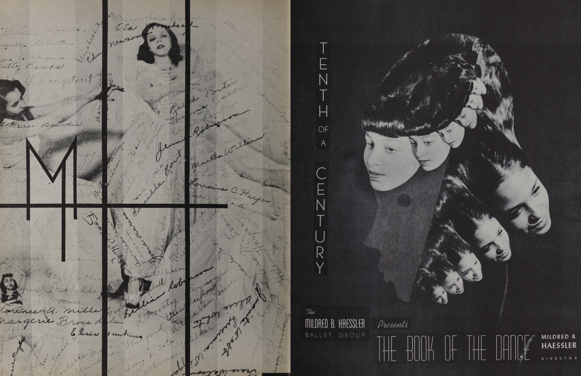
Mildred B. Haessler Dance Brochure
Author/Artist: William McBride
Date: 1947
Medium: Periodical
Credit: John M. Wing Foundation on the History of Printing, Newberry Library
Design for Chicago’s thriving arts and cultural events provided a place for designers to be more experimental and playful with their type. In the Mildred B. Haessler Dance Brochure, art director William McBride experiments with photomontage techniques and combines modern typefaces, monograms, and handwriting, creating an intimate, surreal layout that reflects the dreamlike and playful qualities of dance.
Los prósperos eventos artísticos y culturales de Design for Chicago brindaron un lugar para que los diseñadores fueran más experimentales y divertidos con su tipo. En el folleto de danza de Mildred B. Haessler, el director de arte William McBride experimenta con técnicas de fotomontaje y combina tipos de letra modernos, monogramas y escritura a mano, creando un diseño íntimo y surrealista que refleja las cualidades oníricas y lúdicas de la danza.
Letters Beyond Form is part of Art Design Chicago, a citywide collaboration initiated by the Terra Foundation for American Art that highlights the city’s artistic heritage and creative communities. This project is funded by the Terra Foundation for American Art.
